Web | Forefield Portal
Designing the admin dashboard for a financial company.
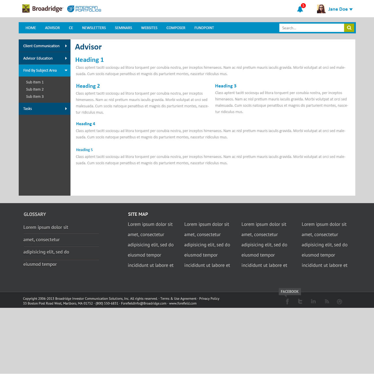
Forefield was a similar company to us (Emerald Connect), and we were going to combine our offerings into one cohesive product. My team was tasked to recreate the user interface design of an existing portal to make it easier on the eyes and to make it more functional from a usability aspect. The goals that I set for myself on this particular project was to make the UI feel uncluttered unlike it’s previous interface.
These were the proposed visual designs:

After a couple of rounds of revisions and meeting with upper management, the overall design changed and morphed into the finalized comps seen here:

I wanted to allow the user to scroll through the content on the redesign, creating more interaction between the user and the portal. Most users enjoy scrolling now, which also translates better in responsive design. Take a look at the live prototypes of the original design (some images are missing because the links are broken to the original images) and the design that I came up with.