Graphic | Foresyte
Coming up with a company logo and branding.
This project was to help create a new brand logo for a parent company that Emerald Connect was going to merge with. They actually didn’t end up merging with them in the end since they were purchased by Broadridge. This was a reall fun project to work with and I learned a lot while working on it.
So first iterations looked like this:

We presented them to upper management and we received some really good feedback. They did want to see more versions and they said that they would like to see them with the optional tag lines. We came back and presented these for our second iteration:
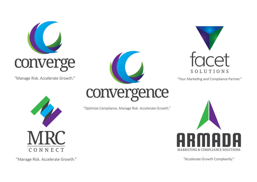
Now we started getting somewhere. Some feedback that we received was that they liked the logo and name together and that they liked the logos better without the tag lines. We then came back and presented these:

Bang! they immediately jumped all over the Forsyte logo but suggested that it might be better if it were spelled with the letter e (i.e. Foresyte). We thought that was a fantastic idea and we thought we would also show them a second version as well. Our idea for the second version was to take the circle and try to shape it more like an eye. We presented these 2 options and the ultimately went with the circle logo.
