Explore multiple directions.
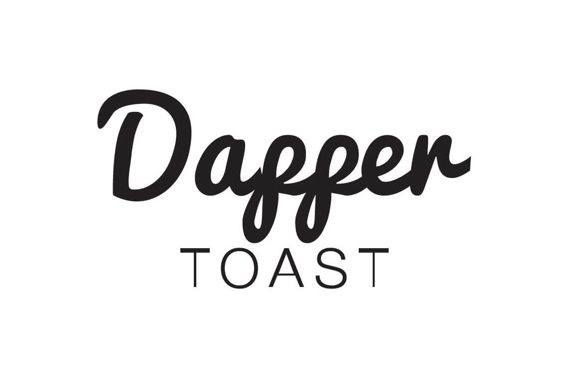
I produced a range of concepts to investigate different relationships between the name, typography, and supporting visual elements.
An independent exploration of a refreshed typographic identity.
01 / Context & contribution
A former colleague shared the identity of the company she had joined. I saw an opportunity to explore an alternative visual direction as a personal design exercise.
I developed a series of logo concepts independently. The company was not seeking a rebrand, so this work was an uncommissioned portfolio exploration rather than a client engagement.
02 / Design decisions
I produced a range of concepts to investigate different relationships between the name, typography, and supporting visual elements.
The presented mockups helped show how the concepts might read beyond an isolated logo.
The concepts are shown as personal work. They should not imply that Dapper Toast requested, approved, or used a new identity.
03 / The work
Original project artifacts. Open an image to inspect it at full size.




04 / Outcome & reflection
The result was a set of alternative logo concepts and two preferred directions for my own exploration. No adoption, client approval, or business result is claimed.
This piece represents the exploratory side of my visual-design practice: generating alternatives, comparing them, and making a considered selection without presenting speculation as shipped work.
I’m exploring Product Designer opportunities. Tell me about your team and the problems you’re working on.