Reduce competing visual elements.
I organized the proposed interface around clearer groups and a more deliberate hierarchy, addressing the clutter that motivated the redesign.
A less cluttered interface for a combined content offering.
01 / Context & contribution
Emerald Connect and Forefield were exploring a combined offering. The existing portal needed a clearer interface that made the content and available functions easier to navigate.
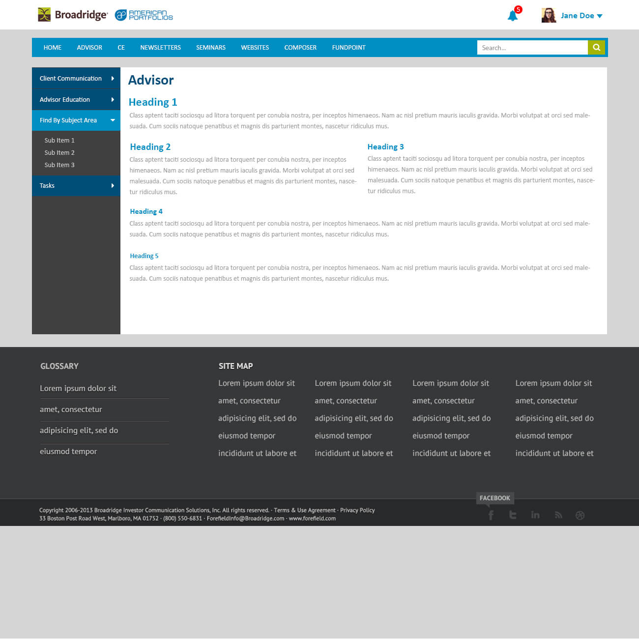
I worked on the portal’s UI design, developing dashboard and content-page concepts and revising them through reviews with upper management.
02 / Design decisions
I organized the proposed interface around clearer groups and a more deliberate hierarchy, addressing the clutter that motivated the redesign.
I explored both an overview and a supporting content page so the experience had a consistent structure at different levels.
I used scrolling content in the redesigned prototype as an alternative to the previous interface. This was a design direction, not a validated preference shared by every user.
03 / The work
Original project artifacts. Open an image to inspect it at full size.


04 / Outcome & reflection
The concepts developed through several rounds of management review into final design comps and a prototype exploration. This work is presented as interface design, rather than a confirmed production launch.
The project shows how I move from an initial visual direction to a more resolved interface through stakeholder feedback, while keeping the information hierarchy at the center of the work.
I’m exploring Product Designer opportunities. Tell me about your team and the problems you’re working on.