Explore the whole identity together.
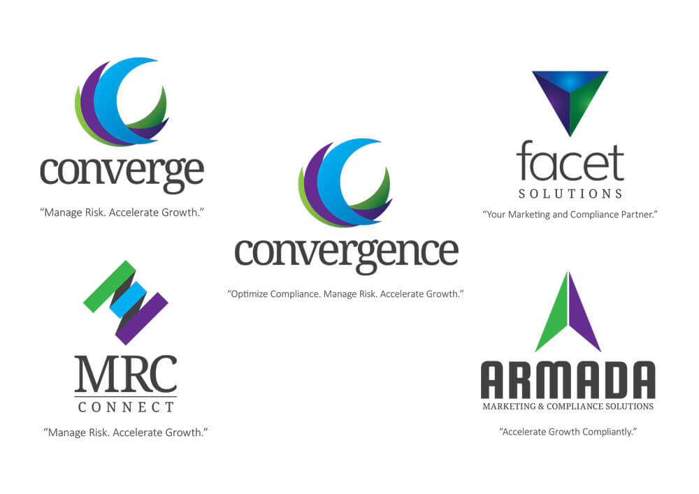
Early rounds considered name, symbol, and tagline combinations so the team could assess how the elements worked as a set.
Iterating a proposed parent-company identity with leadership.
01 / Context & contribution
Emerald Connect was considering a merger that called for a parent-company identity. The team needed a logo direction that leadership could evaluate alongside possible names and taglines.
I participated in developing and presenting successive identity concepts, using management feedback to refine the relationship between the name, symbol, and optional tagline.
02 / Design decisions
Early rounds considered name, symbol, and tagline combinations so the team could assess how the elements worked as a set.
Leadership preferred the name and logo together without a tagline. Later rounds focused on those combinations.
After a preferred Forsyte direction emerged, we explored the Foresyte spelling and a more eye-like symbol. Leadership ultimately selected the circular mark.
03 / The work
Original project artifacts. Open an image to inspect it at full size.



04 / Outcome & reflection
A preferred circular identity was selected during the exploration. The planned merger did not proceed; Emerald Connect was later acquired by Broadridge. The record does not establish a public rollout of this identity.
This work shows iterative visual development through concrete options and feedback, with a clear distinction between a selected concept and a launched brand.
I’m exploring Product Designer opportunities. Tell me about your team and the problems you’re working on.